
Technology
Top 5 Tips, What Should Be a Website for Your Business

What should be a website to promote business? This is probably the main question that worries every client. After all, a website is often not only a company’s business card on the Internet but also an effective marketing channel. And in order for your website to be really successful, you need to clearly understand what goals you are pursuing when creating it and what tasks it should solve.
Let’s look at the successful example of the 22Bet website to see what things are important to customers. So, the site is designed in turquoise and blue colours, and the important information is highlighted in red.
The design of the site is simple and quite standard, but it can be attributed to the pluses, as nothing distracts from betting. On the main page on the left side there is “Line”, on the top right there is a betting coupon, under it there is quick access to install the bookmaker’s mobile application, which is available to users of the two most popular operating systems – Android and iOS.
Using this example, it is clear that the site really does play a huge, almost a key role in how you are perceived by customers around the world. In this article, we will tell you about the main points to consider when creating a venue to be successful.
1. Make a Decent Mobile Version of the Site
According to statistics compiled by OuterBox, more than 79% of users visit sites and make purchases from mobile devices rather than the desktop. At the same time, 84% have trouble making purchases on mobile versions, and 40% go to competitors’ resources after receiving a negative user experience.
It is very unpleasant when a visitor opens a mobile site and it looks and works poorly. The user is unlikely to try to figure out the difficulties, click on buttons several times or wander around in an unintuitive interface – it’s easier for him to switch to another site.
Even worse, if you open the company website on a smartphone and see that it simply doesn’t have a mobile version. Zooming in and out of the full version with your fingers in the browser to see anything is just wild.
So make sure your site has a good mobile version or even a dedicated app. It should be designed to adapt intuitively to any device. Make sure that all the buttons and elements on the page are easy to interact with your fingers.
2. Come Up With a Catchy Name
A simple, clear, memorable domain name is very important for your website.
The right domain in the hands of an experienced team increases the credibility of your customers’ and affiliates’ business, increases user conversions and ROI, and reduces viral marketing costs.
Finding an unoccupied and euphonious name is not easy, but you’ll have to try. Remember that the shorter it is, the better: it’s easier to remember and type it into the address bar. The most famous sites in the world are Google, Facebook, Twitter, and Instagram. What do they have in common? That’s right, their names are not hard to remember and type in. And it’s also important that the name can be easily pronounced out loud.
Make sure you don’t misspell the words. Sure, there are famous sites with intentionally misspelt names like Flickr and Tumblr, but only very big companies will allow that. If you have an auto parts store, such misspellings in the site name will look ridiculous.
3. Let the Site Call to Action
You open Dropbox or Evernote – and immediately click “Upload.” You go to Instagram – and click “Sign Up.” You don’t have to search for anything or think about it for a long time. Why? Because these sites effectively call to action with their CTA elements.
Sometimes you go to an unfamiliar company’s website, don’t find a single CTA element, and can’t figure out what the resource is offering you. Provide a service? Sell a product? Subscribe to a newsletter? What do they do there anyway?
Put the appropriate buttons right on the home page so that the visitor doesn’t have to look for them for a long time. Explain simply and clearly to the visitor what will happen if he clicks on the CTA element.
If you have created a cool online service – let it be possible to register with one click immediately after loading the site. If you provide locksmith services – make the “Call a Master” button right in front of the user’s eyes. There is no need to hide CTA elements at the bottom of the page because not all visitors are so patient to scroll to the very end.
4. Make It Easier to Navigate
Access to information, services, and purchases should be easy. Ideally, the user shouldn’t have to think about how to find something on your site at all.
Surely you notice that the vast majority of sites are designed in a similar pattern. For example, the buttons for search, registration, and account login are always on the top right. You can switch between the main pages with information using the tabs at the top. And the buttons of social networks and information about the company are placed at the bottom. Don’t reinvent the wheel, because if a user finds your site intuitively incomprehensible, he will leave it.
And do not forget to give the user the opportunity at any time to return to the home page of the site, eliminating the need to bother clicking on the browser button “Back”.
5. Don’t Make Any Typos or Mistakes
It’s true that misspellings can happen. But in order for your business to be taken seriously, the text on your site must be grammatically correct. Errors of all kinds discourage visitors, making them think your business is untrustworthy. After all, how can you run a business if you can’t figure out the spelling?
As Jeffrey Gitomer, an American writer and business coach, says, “Your grammar is a reflection of your image. Whether it’s good or bad, you will give the appropriate impression. Fortunately, you can control that.”
Carefully check and proofread your texts. Literacy is like hygiene. You can be the world’s most brilliant businessman, the one who puts Bezos and Zuckerberg behind his belt. But if you present yourself to clients and partners with an unwashed head and dirty shoes, your talents are unlikely to be appreciated.
The Rise of AI Face Swap Technology
AI face swap technology has evolved from a novelty into a powerful creative tool. What once required professional video editing software and hours of manual work can now be done in seconds with a single click. Fueled by advances in deep learning and generative AI, face swap tools have become remarkably realistic and accessible. By 2026, millions of content creators, marketers, filmmakers, and everyday users rely on these tools for entertainment, business, and personal projects. As the technology matures, choosing the right tool has never been more important — or more competitive.
How to Use AI Face Swap in Your Work and Daily Life
AI face swap tools are no longer just for fun — they’re reshaping how we work and communicate:
- Content Creation & Social Media: Swap faces to create viral memes, funny videos, or personalized content that drives engagement on TikTok, Instagram, and YouTube.
- Marketing & Advertising: Brands use face swap to localize ad campaigns by replacing models with regional faces, saving time and budget on reshoots.
- Film & Video Production: Indie filmmakers use AI face swap for de-aging effects, stunt doubles, or recreating scenes without expensive CGI.
- E-Commerce & Fashion: Virtual try-on experiences let shoppers see how they’d look in different outfits or hairstyles.
- Personal Fun: Swap your face onto movie characters, historical figures, or your favorite celebrities for entertaining social content.
- Education & Training: Create realistic training simulations or educational videos with customized faces.
How to Judge a Good AI Face Swap Tool
Not all face swap tools are created equal. Here’s what to look for:
- Realism & Quality: Smooth blending, accurate skin tone matching, and consistent lighting.
- Speed: Results in seconds, not minutes.
- Ease of Use: An intuitive interface for non-technical users.
- Privacy & Security: Clear data policy — no storing images without consent.
- Multi-Format Support: Handles photos, videos, and real-time swaps.
- Customization Options: Fine-tuning for expression, angle, and lighting.
- Pricing & Value: Transparent pricing with a free tier or trial.
Part 4: Top 5 AI Face Swap Tools in 2026
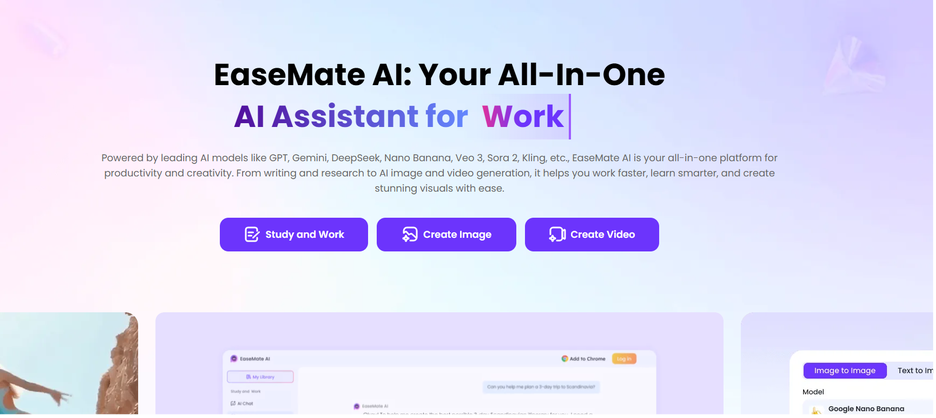
🥇 1. Easemate — Best Overall Pick
Website: https://www.easemate.ai/
🔑 Key Features: Supports photo & video face swapping with real-time preview, batch processing, automatic skin tone matching, intelligent lighting adjustment, and multi-face detection for group photos. Privacy-first design — images are never stored without consent.
✅ Pros: Exceptional realism with accurate edge detection and shadow rendering. Lightning-fast even for HD video. Beginner-friendly interface with zero technical knowledge required. Flexible, affordable pricing for individuals and teams. Strong privacy policy for peace of mind.
❌ Cons: Batch video processing and 4K export require a paid plan.
2. DeepFaceLab — Best for Advanced Users & Filmmakers
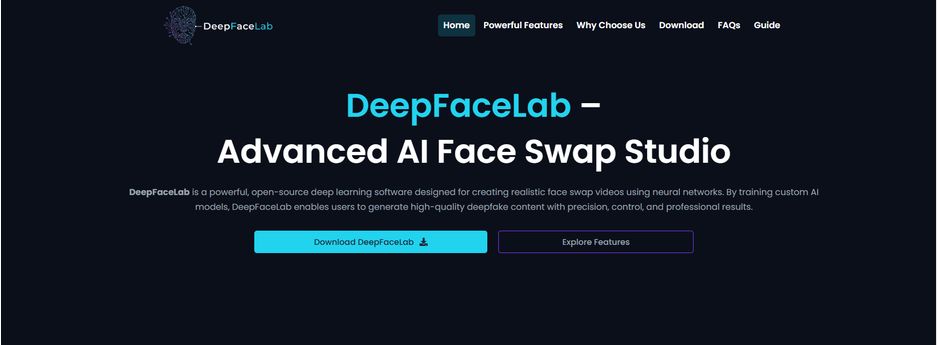
🔑 Key Features: Deep neural network-based swaps with full control over face alignment, blending modes, mask refinement, and custom model training on personal datasets.
✅ Pros: Completely free and open-source. Unmatched customization for experienced users. Huge active community with tutorials and pre-trained models. Ideal for long-form video and cinematic-quality projects.
❌ Cons: Steep learning curve, requires high-performance GPU, no cloud version.
3. Reface — Best for Fun & Social Media
🔑 Key Features: Mobile-first app with a massive library of celebrity clips, movie scenes, GIFs, and meme templates. Real-time facial landmark mapping and one-tap social sharing to Instagram, TikTok, and WhatsApp.
✅ Pros: Extremely easy to use — just take a selfie and pick a template. Library updated regularly with trending pop culture content. Perfect for casual entertainment and viral social content.
❌ Cons: Mobile only; not suitable for professional or high-resolution output.
4. FaceSwapper.ai — Best for Quick, No-Fuss Photo Swaps
🔑 Key Features: Browser-based, one-click photo face swap with no account required. Supports JPG, PNG, and WEBP formats. Developer-friendly API for app integration and automated workflows.
✅ Pros: Zero-signup experience — incredibly accessible for one-off tasks. Fast, straightforward, and frictionless. Robust API for developers needing programmatic access.
❌ Cons: Limited video support and fewer customization options. Best for simple, single-image use cases.
5. Vidnoz AI — Best All-in-One Video Platform
🔑 Key Features: Full video creation suite including face swap, AI avatar generation, text-to-video, voice cloning, lip-sync dubbing, and multilingual video translation. Face swap integrates seamlessly with the broader production workflow.
✅ Pros: Outstanding value as a multi-function platform. Solid video output quality with regular improvements. Generous free tier available. Great for businesses producing localized or multilingual video content at scale.
❌ Cons: Face swap is a secondary feature — lacks the depth and advanced controls of dedicated tools.
Part 5: Conclusion
AI face swap in 2026 is smarter and more accessible than ever. Among all options, Easemate stands out as the best all-around choice — combining professional-grade quality with an effortless experience and a privacy-first approach. Start with Easemate today.
Part 6: FAQ
Q1: Is AI face swap legal?
Yes, for personal and creative use. Using it for deception or non-consensual imagery is illegal in many jurisdictions.
Q2: Is Easemate free?
It offers a free tier; premium plans unlock batch processing and high-res video output.
Q3: Can these tools work on videos?
Yes — Easemate, DeepFaceLab, and Vidnoz AI all support video face swapping.
Q4: How do I protect my privacy?
Choose platforms with clear privacy policies. Easemate is known for its privacy-first approach.
Q5: Photo vs. video face swap — what’s the difference?
Photo swap is faster and simpler. Video requires frame-by-frame processing but delivers more impressive results.
Q6: Do I need technical skills?
Not at all! Tools like Easemate are designed for everyday users — just upload and let the AI handle the rest.
By Adedapo Adesanya
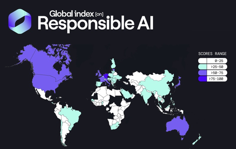
Nigeria has emerged as Africa’s highest-ranked country in the latest Global Index on Responsible AI (GIRAI), climbing 42 places globally in just two years.
Nigeria rose from 80th globally in 2024 to 38th in the world with a score of 45.93.
The GIRIA ranking boosts Nigeria’s appeal as a destination for AI talent, innovation and investment.
According to the Cape Town-based independent research and policy think tank, the ranking is one of the world’s most comprehensive assessments of responsible AI. It evaluates 135 countries across five pillars: inclusion and diversity, ethics and sustainability, labour and skills, trust and safety, and AI use in public services.
Despite that rapid adoption, the report found that public governance capacity remains weak. Average GIRAI scores stand at only about 35 out of 100 globally, while evidence of implementation exists in just 55 per cent of countries with responsible AI frameworks, dropping to 45% across the Global South.
Nigeria’s rise reflects deliberate policy efforts to strengthen its AI ecosystem.
According to the Minister of Communications, Innovation and Digital Economy, Mr Bosun Tijani, the government has accelerated work on its National Artificial Intelligence Strategy (NAIS), expanded digital public infrastructure, invested in digital skills, developed governance frameworks for emerging technologies, and strengthened international partnerships to ensure AI is deployed responsibly.
“This recognition is a testament to Nigeria’s deliberate efforts to build an AI ecosystem that is inclusive, responsible, and aligned with our development priorities,” he said.
“We believe that Africa must not only participate in the AI revolution but also contribute meaningfully to shaping how these technologies are governed and deployed globally.
“Our focus remains on creating the infrastructure, talent, and policy environment that will enable AI to deliver real value for our people and support President Bola Tinubu’s vision of building a $1 trillion economy,” he added.
The report identified Nigeria as a global “Bright Spot” for combining AI skills development with safeguards for children and vulnerable groups.
The index noted that Nigeria is among the few African countries that have attempted to simultaneously prepare citizens for an AI-driven future while strengthening protections against the risks posed by emerging technologies.
It highlighted the National Artificial Intelligence Strategy, which mandates AI literacy programmes, teacher training and broader capacity-building initiatives across the country.
The report also cited the Federal Government’s flagship 3 Million Technical Talent (3MTT) programme for delivering structured AI and machine learning training through a hybrid model designed to reach young people nationwide.
In terms of regulation, GIRAI recognised the Nigeria Data Protection Act and the General Application and Implementation Directive (GAID) 2025 for introducing enhanced safeguards for children’s personal data, including parental consent requirements and restrictions on decisions based solely on automated processing.
The report said these initiatives position Nigeria as an example of how governments can pursue AI adoption without overlooking digital rights and citizen protection.
By Modupe Gbadeyanka
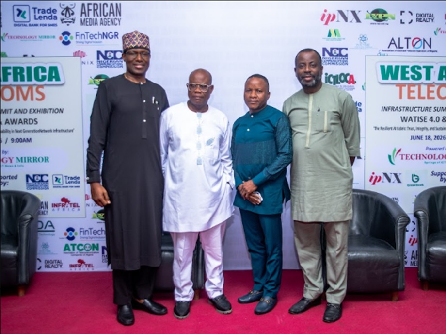
The need for accessible, affordable and locally relevant Artificial Intelligence (AI) to drive Africa’s digital future has been emphasised by the Managing Director of ipNX, Mr Ejovi Aror.
Mr Aror, whose paper was presented by the company’s Director of Strategic Business Initiatives, Mr Olusola Teniola, at the West Africa Telecoms Infrastructure Summit and Exhibition (WATISE) on June 18, 2028, said AI is not a new concept, but has been in existence since 1955 and is an integral part of today’s digital ecosystem, with intelligent algorithms already embedded in so-called ‘traditional’ telecommunications networks and services.
At the event held in Lagos, Mr Aror, in his paper titled Next-G Telecoms Infrastructure and Ethical AI in Networking Management, stated that, “Artificial Intelligence already shapes how networks are managed, optimised, and secured. The conversation is not about whether AI will transform telecommunications, but how we can ensure that its benefits are responsibly deployed.”
He emphasised that while Africa may not have played a leading role during the earliest stages of AI development, the continent still has a significant opportunity to shape the next phase of innovation by developing technologies that address local challenges and realities.
“Africa does not need to be solely a consumer of AI technologies developed elsewhere. There is a unique opportunity to build solutions that reflect our local contexts, address our specific needs, and create value for our economies and communities,” he stated.
The presentation also highlighted the importance of ethical considerations in AI deployment, particularly as intelligent systems become increasingly involved in network operations, service delivery, decision-making processes, and customer interactions.
Mr Aror stressed that the development of AI must be guided by principles of transparency, accountability, privacy, and inclusivity to ensure that innovation delivers meaningful benefits to society.
He further noted that the success of AI across Africa will depend on continued investment in digital infrastructure, including broadband connectivity, data centres, cloud platforms, and reliable telecommunications networks capable of supporting advanced digital services.
The discussions at WATISE 2026 reinforced the strategic importance of the telecommunications industry as the foundation of Nigeria’s digital economy. While stakeholders highlighted the role of telecom infrastructure in enabling innovation across various sectors, participants underscored the need for improved digital literacy, public awareness, and responsible use of emerging technologies.
ipNX was recognised at the event as the Best Customer-centric Telecoms Operator. As Nigeria’s leading technology and connectivity provider, the brand remains committed to advancing the infrastructure, innovation, and collaborative partnerships required to unlock the full potential of AI and support Africa’s digital transformation.